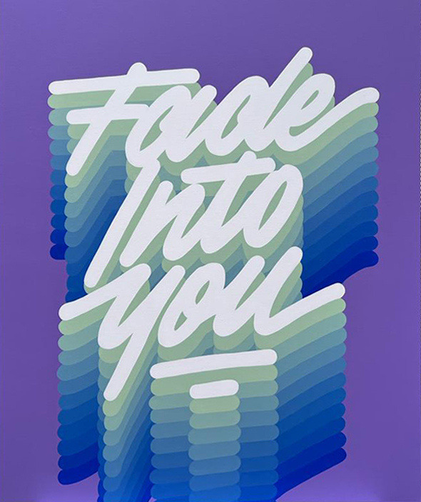
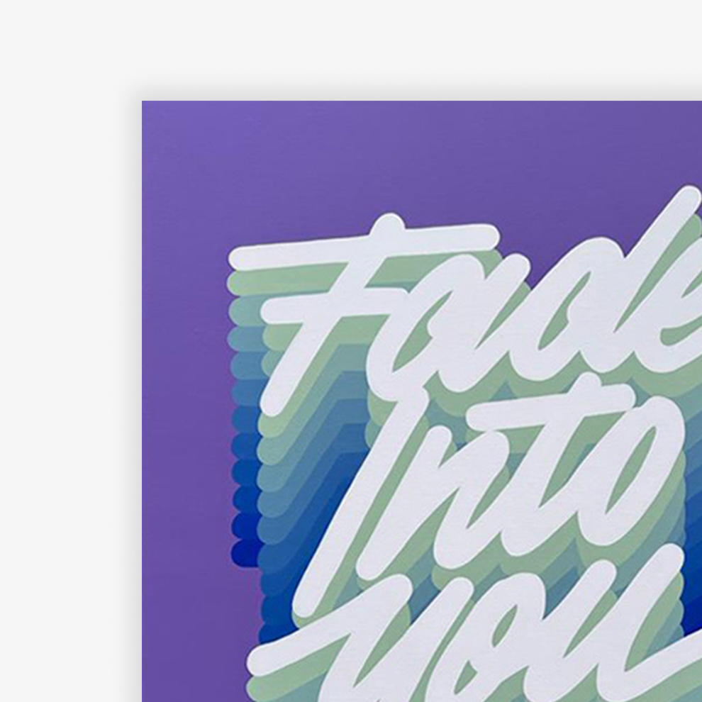
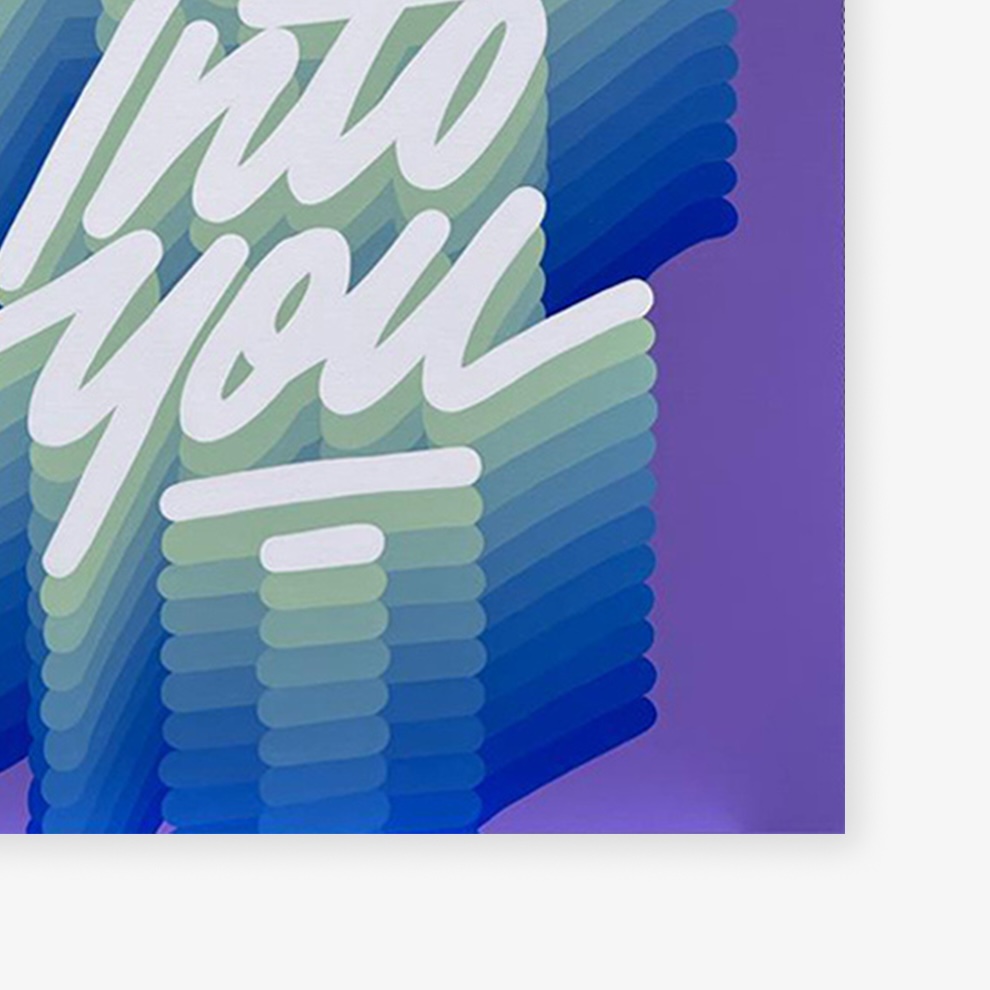
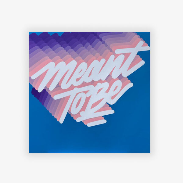
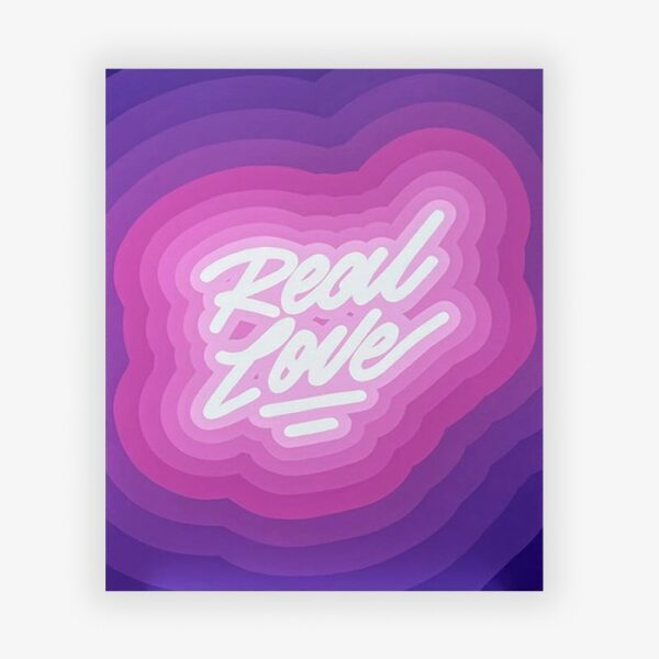
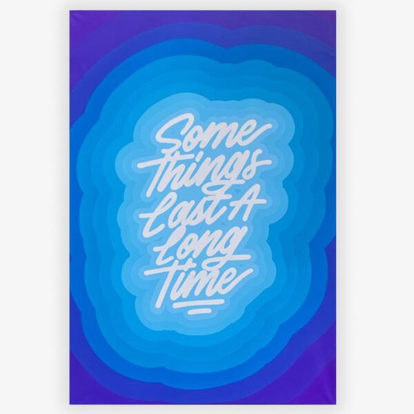
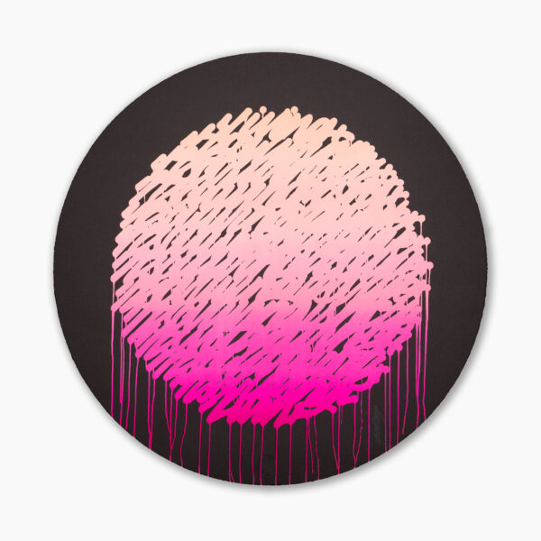
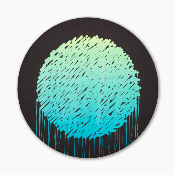
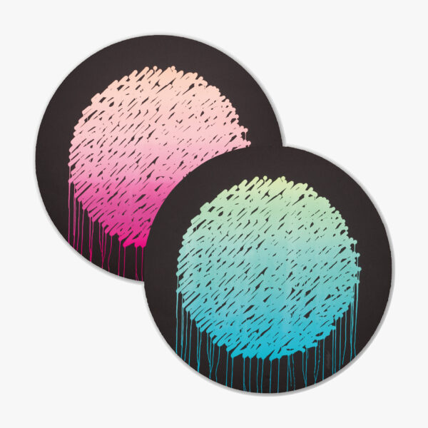
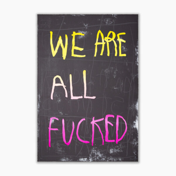
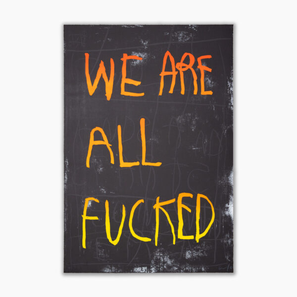
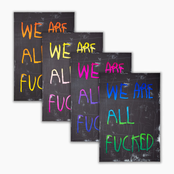
Mexican artist and designer Ricardo Gonzalez, known as IT’S A LIVING, has developed a signature script style that is now easily recognized and widespread- from large-scale murals to commercial work for some of the biggest brands, to a simple sticker in the streets.
The ambiguity in the typographical messages continually creates a dialogue between the viewer and the artwork. “A word is an image” and an image can be interpreted in so many ways, the direct approach of typography has been an exploring path where the main goal is to question our daily living and to produce a positive impact. After all, it’s a living.

